Designed a mobile portal to help streamline and simplify the urgent care check-in process.
Conceptual Project
UX designer
Adobe XD, Miro, balsamiq, Lucid Chart, Zoom
7 months
While I was in my vacation, I had to go to the hospital to get my mother medical assistants. We experience long wait times, being ignored and no one helping my mother to check in.
After an end-to-end process UX process, I've designed the Swift Care. Swift Care is a Mobile website used to streamline the check-in process in urgent care and emergency centers.
I'm bored take me:
User Interviews
Affinity Mapping
Brainstorming Ideas
User Testing
Competitive Analysis
UI design
Wireframing
Prototype
My goals were to develop a product that will improve the experience of going to urgent care and ensure the patient are awareness of their check in process.
First thing I did was to get information on how patients' worldview of the urgent journey is like for them. I gathered this information by sending out interest via professors and IUPUI's Classifieds. I interviewed 7 Patients and 5 doctors. Here are some of the questions we asked them:
Patients and specialist's agreed that lack of communication between nurses and patients made the check in process hard on patients.
12 out of 12 interviewees wanted more Commnication between patients and nurses.
Patients and specialist's agreed that lack giving the patients information about the how priority level works in the urgent care led to more frustrations.
11 out of 12 interviewees wanted a way to understand the triage process.
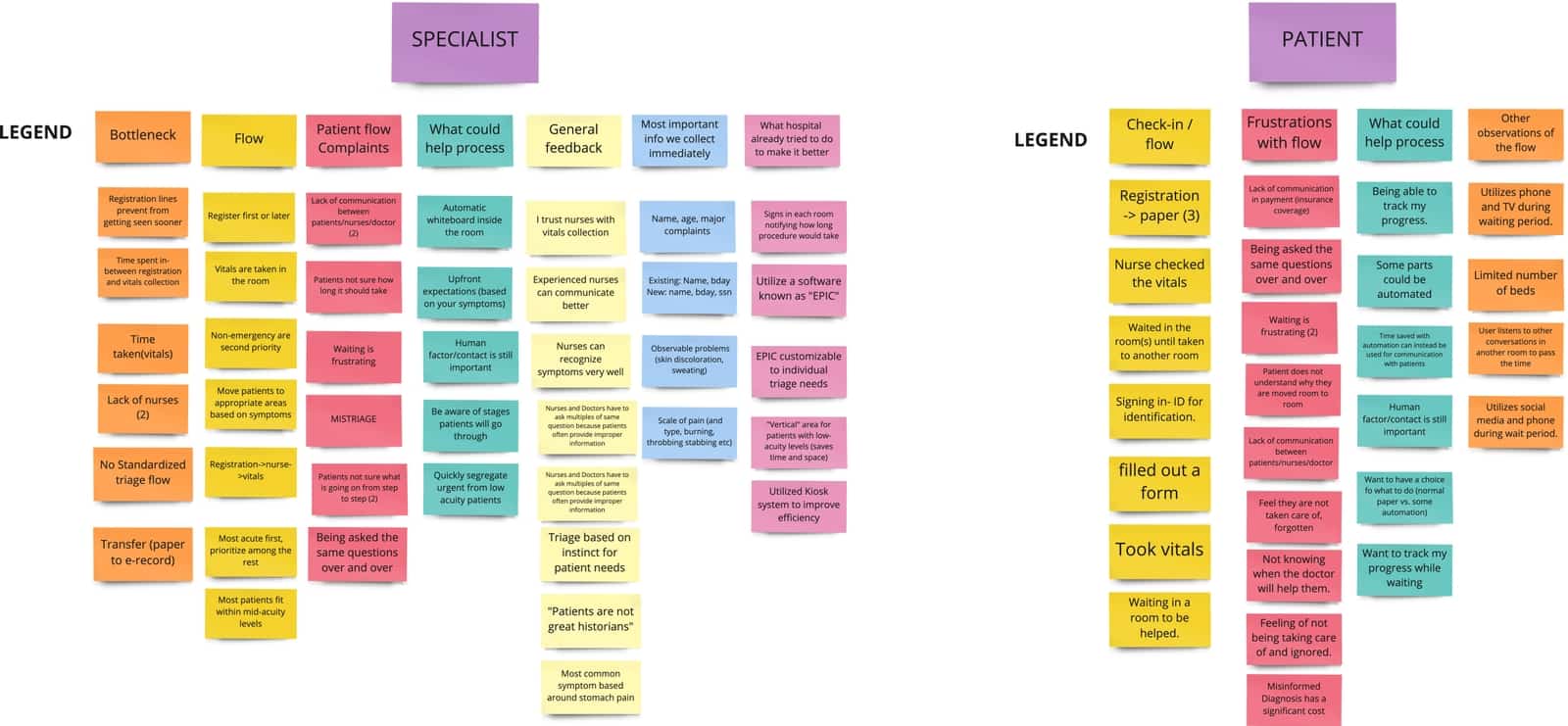
After collecting user research data, I went through the process of affinity mapping to identify patients' wants, needs and goals with a check in systems. Among those who participated in the research,
After doing some user interviews, I wanted to do some competitive analysis on how the urgent care combat this problem. This was done in hopes I could grab some inspirations or see how I could make a design solution that will make an improved check in process.


So, it seems like it most of the competitors only used allowed perspective and old patients to book an appointment.
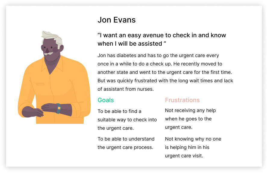
I created a fictional character, Jon whose goals, pain points, and needs aligned with the patients I interviewed. I referred to him throughout the project to stay focused on the audience I am designing for.
Based on what I learned from research, I narrowed down the problem space by developing a more concise problem statement focusing on users like Jon.
"How might we improve the check-in experience for patient satisfaction in urgent care?"
Initially, I dedicated one week to brainstorming and storyboarding, generating a pool of 20 ideas through an exercise. This process culminated in the selection of three primary new concepts, outlined as follows:
Pros: can conveniently check in from the comfort of your home.
Cons: just another application on your phone.
Pros: faster reserve time, instant task completion.
Cons: limited to check in, not advanced enough to let you know your journey throughout the urgent care.
Pro: can check in from the urgent care and get updates on where you are in your process.
Con: Requires you to go to the urgent care check in.
I mapped out a patient flows to understand the user's perspective before beginning the design phase. I aimed to identify and address any potential issues or roadblocks in advance. I organized my flows into one key flow that support my design goals:
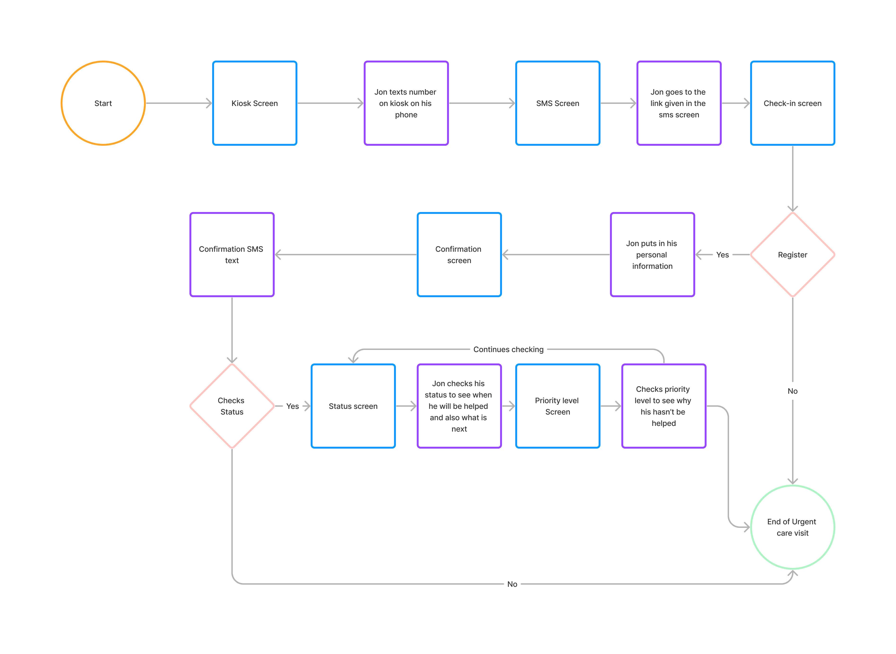
Now it was time to create the wireframe, my wireframe composed of first medium then when I felt confident, I worked on the high-fidelity screens. I utilized this for actively map out how my idea would look like.
-p-3200.png)
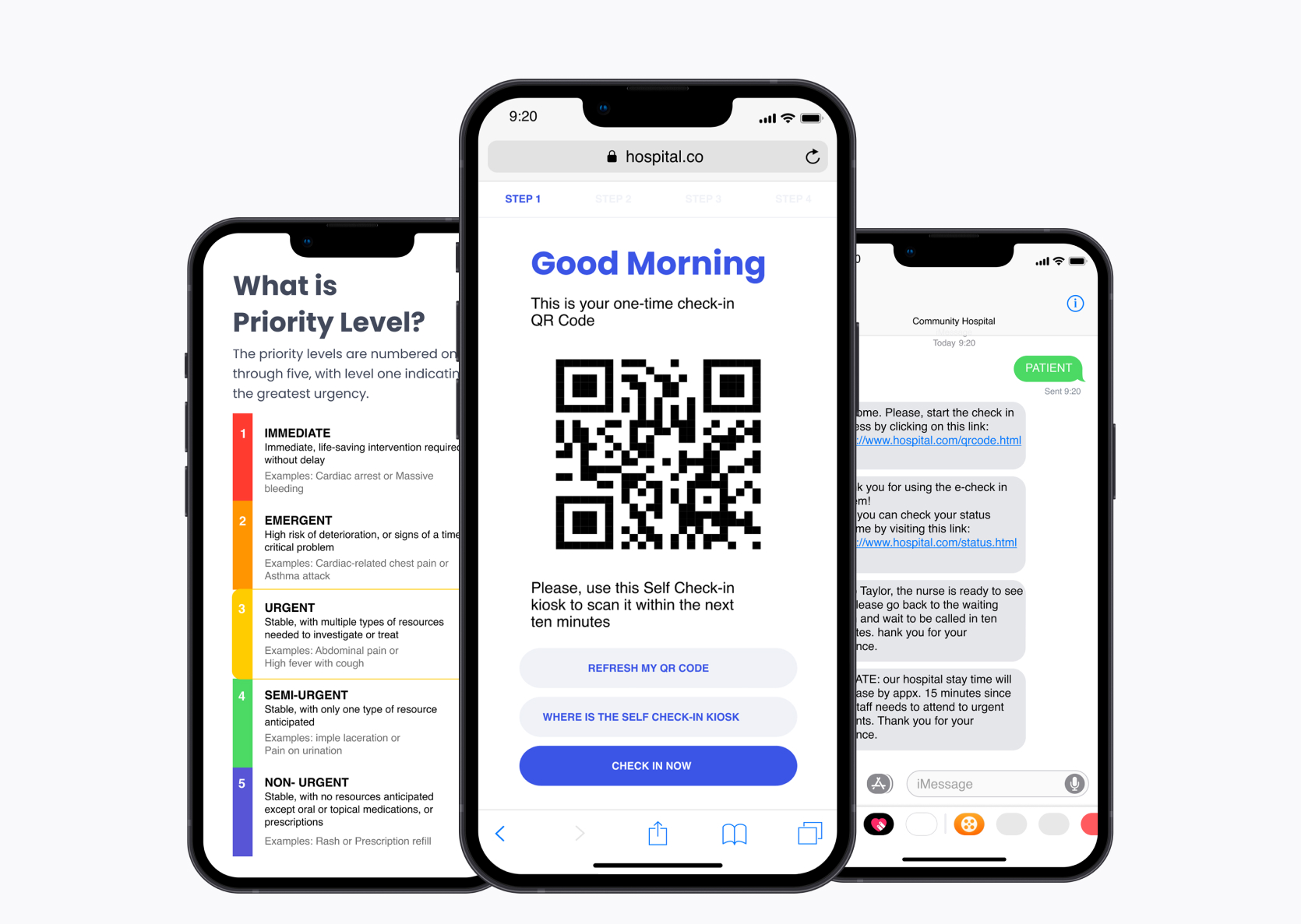
The kiosk provides an alternative registration source where the user will enter the urgent care and the registration process through a booth.
.gif)
Without downloading an application, the user will get updated on where they are in their processes.
.gif)
After creating the High-fidelity prototypes, I conducted a Zoom demo of my prototype for the nurses and patients previously interviewed in my research. This evaluation provided insights into the prototype's strengths and areas for improvement. I gathered valuable feedback for the next future iteration of this project.
“I think your prototype is good. We see all different levels of people here so when you are developing things for a patient... [who] would not have a lot of level of basic understanding. But this product is a very basic that I think everybody can understand. It doesn’t make you feel like it “talks down to you” and it’s very basic, very short. I think it is great.” - Registered Nurse, Emergency Department at Methodist Hospital
"I think your idea is solid, but my concerns are setting a patient’s expectation for time is important to them. What is the average length of stay for a patient with that priority level? What is the average wait time for this level?” -ED Doctor, Emergency Department at Eskenazi Hospital
" I think this is a good idea, it will save me time when I need to go to the urgent care and set my expectations, but my concern is how would a person check-in be using your process but without a phone?" - Participant 2, IUPUI Student
“I am concerned about any privacy or confidentiality issues that might arise when I give my information to the hospital. Take this into account." - Participant 1, IUPUI Graduate Student
While working on this project I was able to learn from both perspective of what the problem is. Although I had some initial biased that specialist (Nurses) didn't really care about who needed help. But this was later debunked by interviewing them and understanding their perspective. I was able to learn a vital solution they had which was the priority level they used to determine who needs help first.
I wasn't able to user test my solution in great details, but I was able to learn valuable insight on what concerns I should consider in a future iteration of this project. I hope to purse these changes more in dept in the future.
.gif)
.gif)